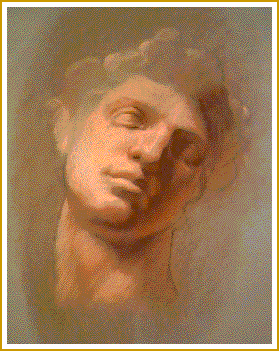
closer view
You may have noticed how, in the supply illustration (page 2), I labeled the pastel colors ( RED 6The approach) = illumination, ( RE 15
) = modulate shade or light, and ( RE 6
) = shade. Those labels indicate the organization of shade and light in the drawing.
Next, I show the background foundation. This color is used just once to prepare the paper to recieve the top three Unison pastels. You see, the top three pastels are pretty soft. If you apply a SOFT pastel to the raw paper, the pastel will act like a slippery lubricant. The next layer of color will not adhear to the paper as well as it should. Generally, it is better to apply a stiffer color to the bare paper, if your top pastel layers will be soft.
Then, there is a line tool. This will be used to make construction lines. And finally, you will use it for the finishing accents where the soft, broad tip of ( RE 6
Finally, the paper. Compare the paper swatch (p.2) to the gray scale. The paper must be a middle value neutral earth color, not too bluish or too reddish or too yellowish. Why? Because when you lay colors like reddish pastels opaquely on a neutral earth color, the neutral color will appear green by simultaneous contrast. This way you get a cool, mysteriously green color if you allow the paper color to be present.
Make sure to use a paper that has enough tooth to grab the pastel, but not too much -- it'll eat the pastel up.
Construction lines. With a light touch, create a well measured line drawing that organizes the silhouette of the subject, and the general location of the features. No need to shade. Don't get fussy now, because next...
Apply background foundation. Smear the color over the paper so that you have created a fairly even "stain" of color. Don't bother trying to stay within the boundaries of your construction line drawing. To get even coverage, use a chamois or rag to smear the scribbled application of pastel around. By now, you may have noticed that your line drawing is practically smeared away. Good. That's how things should be right now.
Definitive line. Now you get to redraw the features. Be a little more assertive with pressure on the line tool. Correct the measuring at this time. If you don't use care when measuring now, your drawing will suffer from the abuse of late stage corrections. Don't try to do shading. Shading comes next.
Low level shading. The shade color you are using first is ( RE 15
Lights. Now apply ( RED 6
Darken the darks. For the cave zones and core shadow areas, use ( RE 6
Adjust edges. To modulate the edges between the general dark and the darker dark, use ( RE 15
Final line. Now you can add accents and details with the line tool. All done.
I have left out lots of subtleties of thought that go into making one of these drawings. I think you can tell there are some important messages implicit in the cautions that I have mentioned. Also, I did not mention much about application technique. If you have a comfort level with drawing, and you want to try this exercise, I think there is enough information here to get you started.
I chose the suggested pastel colors based on flesh color lit by incandescent light, the most common lighting we see today, not necessarily the best.
With the light complexion effect as shown above, there is no possibility of adding highlights with this palette. If you try to add another color, you will throw off the balance of the system. Go ahead, doubt me. Try. Make me wrong. Good for you.