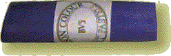
BV 5
Portrait: The blue is forA 30
BG 11
Grey 18
local color influence in skin
tones. Use as coloring in
props.
Landscape: Blues are for shade (A 30), sky and atmospheric effects, and reflection (BG 11 & Grey 18).
BV 5
 Portrait: The blue is forA 30
BG 11
Grey 18
local color influence in skin
tones. Use as coloring in
props.Landscape: Blues are for shade (A 30), sky and atmospheric effects, and reflection (BG 11 & Grey 18).
YG 16
YG 5
Grey 25
 Portrait: These colors shareYG 15
YG 10
similar jobs with the
landscape colors,but the landscape yellows need to be more intense to enhance contrast against soft, distant, atmospheric effects.
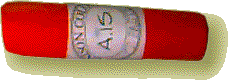
A 15
 Portrait: The red is forRE 9
local color influence.
It works as the red base
in lips and cheeks, and as
synthetic coloring in props.Landscape: This red is found abundantly in nature.
BE 18
A 37
Browns are very helpful for the nuances of flesh and hair tones in portrait work, but dull down the color in landscape. Landscape browns can be made by mixing RE 9 with the other colors in the landscape set.
Green 19
 Portrait: The green is forGreen 25
Green 29
local color influence in skin
tones. Use as coloring in
props.Landscape: These colors are abundant in vegetation. Here, the yellow cast (unlike the blue cast of the portrait green) increases the effect of proximity.
For daylight, it is best to make the sky, which is a light source, lighter than illuminated forms. This is a rule that can be broken, but makes an excellent starting point.
It's true that you can't do red flowers with this set, but I sacrificed red for the more abundant colors in nature. Typically, landscape paintings include only a very small proportion of red, if any at all. Some regional subject matter (Southwest USA comes to mind) will require a red, but I see this as one of the personalized choices that you can make as you add to your set. Red is one of those "easy" choices that you make.
I like black and white as much as the next person. But these are two of the easy choices. That's why you looked for them.
While pastels are at their best when laid down freshly, not blended, you can use these colors to mix out tints and tones right on the paper. This requires light brushing strokes and/or delicate tapping and mashing of the pastel stick into the colors already on the paper. Usually, this will be done by mixing the lighter colors over the darker. With fussing, the colors can be mixed -- and it looks nice! See Portrait Example.
Caution: You won't be able to mix colors on the paper with strong, pressured scrubbing strokes. A light touch will pay off.
Unison Pastels are a new product of very high quality, made in England. You will not necessarily be able to match the above colors with other brands. Unisons are not made by adding white or black to control value, as other brands do. Colors are much more rich. No, I don't work for Unison or their distributors. I just respect their product.
Try calling your better local art supply stores. If you are in the USA and that fails, contact:Unison USA
6953 Shanty Road
Greenleaf, Wisconsin 54126
414/532-6184
Fax: 414/532-6185